


A website is more than just a company or brand’s online presence; it also serves as a guardian that facilitates communication with your target audience, promotes your products or services, and upholds your reputation as a whole.
As in the digital era, there is a large customer base on the web that is using handheld devices such as mobile phones, tablets, or other advanced devices to access the internet. And this is when the significance of responsive web design is recognized.
- Responsive Web Design: What Is It?
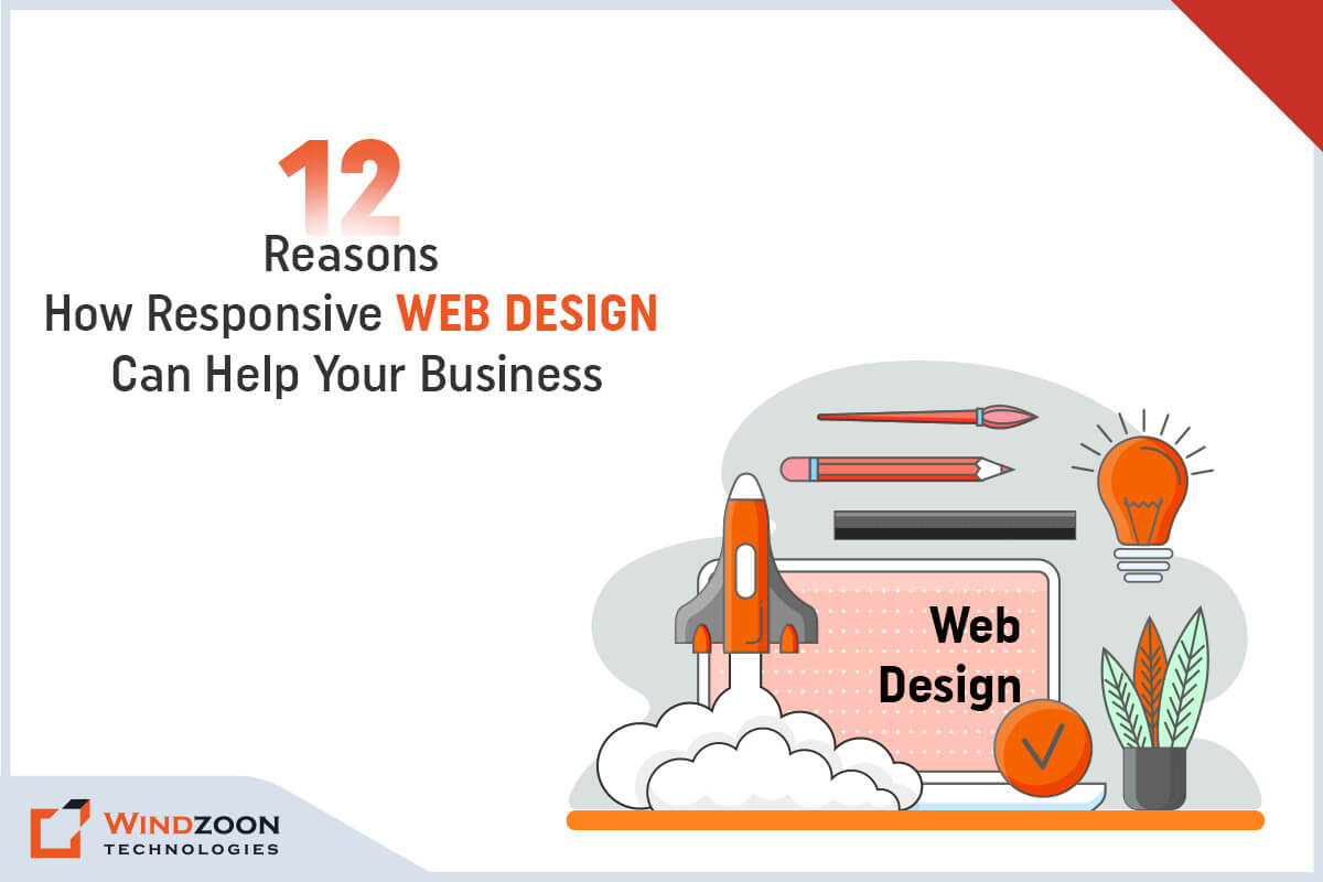
- 12 Astonishing Reasons Why Your Business Needs Responsive Web Design
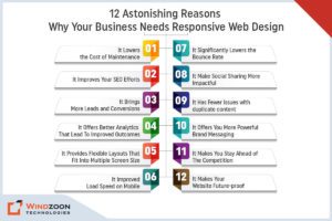
- 1. It Lowers the Cost of Maintenance
- 2. It Improves Your SEO Efforts
- 3. It Brings More Leads and Conversions
- 4. It Offers Better Analytics That Lead To Improved Outcomes
- 5. It Provides Flexible Layouts That Fit Into Multiple Screen Size
- 6. It Improved Load Speed on Mobile
- 7. It Significantly Lowers the Bounce Rate
- 8. It Make Social Sharing More Impactful
- 9. It Has Fewer Issues with Duplicate Content
- 10. It Offers You More Powerful Brand Messaging
- 11. It Makes You Stay Ahead of The Competition
- 12. It Makes Your Website Future-proof
- Conclusion
However, what exactly is responsive web design? And why should businesses need one? Well, keep reading to find out the answers in this article.
Responsive Web Design: What Is It?
Responsive design is a web design & development technique that allows you to create a site that adjusts to the size of the user’s screen. By producing a flexible, responsive, and device-optimized web page, a responsive design will improve a user’s browsing experience.
Mobile usage has skyrocketed in recent years, and responsive design is the most efficient way to reach your customers across multiple devices. Additionally, it guarantees a smooth user experience.
With users increasingly reading information across different devices, responsive web design is becoming extremely important. And to leverage its benefits, you can choose a web design company in USA and India for developing one for yourself.
12 Astonishing Reasons Why Your Business Needs Responsive Web Design
12 Astonishing Reasons Why Your Business Needs Responsive Web Design
1. It Lowers the Cost of Maintenance
Running two versions of the same website is not a cost-effective option. But by using responsive web design, you eventually lower the cost of maintenance. Besides, it takes comparatively less time in setting up, easier to maintain a website than working on two. Thus, you are making a wise decision and making an inexpensive investment in your website that is ready to be accessed through all devices.
2. It Improves Your SEO Efforts
Responsive websites have the most chances of getting ranked high in SERPs. A more user-focused experience brings more attention to a website. What is more interesting is that Google also recommends making a responsive website design pattern.
Why do you think Google prefers responsive design? The main reason is that they use a single URL, which makes crawling and indexing the content on your domain much easier.
Additionally, they provide a better user experience. And as you should be aware by this point, user experience ranks highly among Google’s SEO criteria. Thus, having a Responsive website will help you convert and retain more clients in a long term.
3. It Brings More Leads and Conversions
According to Formstack research, the average conversion rate for smartphones is 64% higher than the average conversion rate for desktops. It is obvious why developing a user-friendly, responsive website is essential for raising conversion rates.
As users spend more time on your website, they will start to gain trust, which will lead to higher conversion rates. It can be annoying for users to constantly be redirected when they try to sign up for a service, whether it’s your newsletters or a purchase.
4. It Offers Better Analytics That Lead To Improved Outcomes
One design for multiple devices makes tracking the growth of your website easier. As all reports and data come from a single source, your analytics teams can deliver excellent results.
Individual page analysis in terms of orientation, breakpoints, and other elements to track user behavior. And assist your developers and coders in creating newer designs to optimize the ideal visitor behavior and comprehend what causes a visitor to leave a page early.
It will give you the ability to precisely plan how to improve your landing page and put the required call-to-actions in a way that increases viewability and boosts conversion rates.
5. It Provides Flexible Layouts That Fit Into Multiple Screen Size
Responsive design layouts offer a lot of flexibility. The grid system used in responsive websites allows the websites to rearrange themselves automatically based on screen size.
For the purpose of developing more dynamic and adaptable layouts, responsive website classes are used. Websites that are responsive also use responsive texts and images. And Images, videos, & slides that are responsive automatically scale to fit the size of the screen.
6. It Improved Load Speed on Mobile
As per Google PageSpeed Developers, standards recommend that content above the fold on a mobile device load in less than one second, with the entire page loading in less than two seconds.
Responsive websites are designed to load quickly on all platforms. But they are especially fast on smartphones and tablets. Fluid grids and adaptable images shorten the time it takes for a web page to load. It directly affects how long your users stay on your site.
And the longer a visitor stays on a page, the more engaged they are with the website. It also increases the chances of the same visitor returning. When a single user returns to the website, it gains trust and authority.
7. It Significantly Lowers the Bounce Rate
Even if a website ranks well in search results, if it does not work well for mobile and tablet users, the bounce rate will be a significant issue.
Mobile versions of websites may have a high bounce rate if the content they provide is too scaled down or too dissimilar from the content offered on the desktop version.
Google might then interpret a high bounce rate as evidence that a website isn’t providing users with relevant content, which is likely to result in a drop in rankings.
8. It Make Social Sharing More Impactful
If your website is responsive, you can increase social shares for a single URL. And when the link is shared, all of the content will be understandable and simple to navigate. Regardless of where the content is viewed (desktop, tablet, or mobile).
Multiple versions of the same page lessen the impact of any social shares, which harms SEO.
9. It Has Fewer Issues with Duplicate Content
The benefit of using a single responsive website rather than separate desktop and mobile versions is that it eliminates the possibility of duplicate content issues, which can harm your website’s search ranking.
Additionally, any SEO work you do to rank your desktop website will automatically be applied to your mobile version as well, cutting down on redundancy.
10. It Offers You More Powerful Brand Messaging
Your website is a crucial tool for engaging your audience with your brand messaging. Numerous design components, including the colors, fonts, graphics, and logos used on your website, support the promotion of your brand and your narrative.
Responsive web design ensures that all of these elements are consistent across all devices used to access your website. This will increase brand recognition and ensure that your entire audience receives consistent messaging.
11. It Makes You Stay Ahead of The Competition
It is crucial to stay one step ahead of the competition in business. If an increasing number of your users/customers are using their mobile devices to browse and make purchases online. Then you should also accommodate your audience by having a mobile-friendly site.
Only a small portion of websites are currently set up to fully benefit from responsive web design. Being an early adopter of this technology can give your company a sizable advantage over the competition.
12. It Makes Your Website Future-proof
Technology is evolving and changing all the time. And because of this, it is challenging to predict what will happen next.
The adaptability of responsive website design to various screen sizes is just one of its many advantages. As a result, it will be optimized for and compatible with smart glasses and watches in the future!
Therefore, a responsive website design is a wise investment if you want to future-proof your website and possibly save money down the road.
Conclusion
Many people access the internet using their mobile phones as opposed to desktop computers and laptops. Your website must therefore look fantastic and function flawlessly across a variety of platforms.
Because 83% of mobile users believe that a seamless experience across all devices is essential. Furthermore, 57% of people would not recommend a company solely because it has a poorly designed mobile website.
If your website’s design isn’t already responsive, it’s time to enlist the aid of a reputable web design agency and redesign it to be more responsive.
Our designers at Windzoon Technologies create multi-responsive, human-centered websites by adhering to the best UI/UX design practices. To avail of our unique & bespoke web design services, visit us at windzoon.com and get a quote.

Soham Trivedi is a co-founder of Windzoon Technologies and has been working as a business development manager for more than 10+ years. He is mastered in business management but his passion for writing has driven him toward the content writing field. Apart from being a business development manager, Soham Trivedi is a successful content writer and a technology lover and has been writing across various disciplines.
 +91 9904713335